Yahoo! and Bing Making User Interface Changes Too
by Admin
23 Sept
by Ian Everdell
by Ian Everdell
http://www.enquiro.com
Everybody’s talking about Google Instant – is it faster, is it easier, is it a better experience? But they’re not the only ones tweaking their interface in the hopes of changing the search experience.
http://www.enquiro.com
Everybody’s talking about Google Instant – is it faster, is it easier, is it a better experience? But they’re not the only ones tweaking their interface in the hopes of changing the search experience.
In the last couple of days, both Yahoo! and Bing have announced changes to the way they present search results as well. Yahoo! takes a stab at presenting a richer experience when you search for entertainment-related information, and Bing has used the power of HTML5, Windows 7, and IE9 to make the search experience more desktop-like. Let’s look at Yahoo! first.
Yahoo! the Entertainer
Announced in a blog post yesterday, Yahoo! is “making one of [their] most significant updates to Yahoo! Search to provide new experiences” this fall.
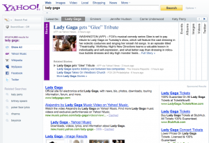
The interface changes they showed yesterday revolve around “information-rich topics” like music, news, and other entertainment-related searches. At the top of the search results page, you’ll see rich content giving you easy access to images, movies, news, events, and even tweets. You’ll also be able to view slideshows of images and news stories right on the SERP.

Information-rich entertainment and news results in the updated Yahoo! search interface.
Bing to the Future
Taking advantage of HTML5, an updated browser engine in IE9, and the capabilities of Windows 7, Bing announced their new, “more beautiful” search experience on Wednesday. And I’ll admit, it looks pretty slick.
The first thing you notice is that the full-size image that lives behind the Bing search box can be a fully animated video or a zoomable image, thanks to the power of HTML5. Once you get to the SERP, they’ve made a number of enhancements that make the experience feel more desktop-like:
Windows 7 has also allowed the Bing team to add a “jump list” of common tasks, like shopping, flights, and news, to the IE9 window preview in the Windows taskbar. With a single click, you can go from your taskbar to these common tasks (seems appropriate for a “taskbar”, right?).
What do you think?
Good? Bad? Were you mesmerized by the ocean background in the Bing video like I was?
Both engines claim that they’re making these changes based on lots of research and user feedback.
So give us your feedback – let us know in the comments below what you think of these changes Yahoo! and Bing are making to the search experience.
© 2010 Enquiro Search Solutions.
Yahoo! the Entertainer
Announced in a blog post yesterday, Yahoo! is “making one of [their] most significant updates to Yahoo! Search to provide new experiences” this fall.
The interface changes they showed yesterday revolve around “information-rich topics” like music, news, and other entertainment-related searches. At the top of the search results page, you’ll see rich content giving you easy access to images, movies, news, events, and even tweets. You’ll also be able to view slideshows of images and news stories right on the SERP.
Information-rich entertainment and news results in the updated Yahoo! search interface.
Bing to the Future
Taking advantage of HTML5, an updated browser engine in IE9, and the capabilities of Windows 7, Bing announced their new, “more beautiful” search experience on Wednesday. And I’ll admit, it looks pretty slick.
The first thing you notice is that the full-size image that lives behind the Bing search box can be a fully animated video or a zoomable image, thanks to the power of HTML5. Once you get to the SERP, they’ve made a number of enhancements that make the experience feel more desktop-like:
- When you scroll down the page, the left rail and top navigation (quick tabs) get pinned to the screen – no more scrolling back up to the top of the page if you want to access related searches, search history, or the vertical searches.
- When you use the quick tabs, HTML5 allows seamless, animated transitions, rather than a “jarring” page reload
- Image and video previews that are “bigger, bolder, and easier to trigger”
Windows 7 has also allowed the Bing team to add a “jump list” of common tasks, like shopping, flights, and news, to the IE9 window preview in the Windows taskbar. With a single click, you can go from your taskbar to these common tasks (seems appropriate for a “taskbar”, right?).
What do you think?
Good? Bad? Were you mesmerized by the ocean background in the Bing video like I was?
Both engines claim that they’re making these changes based on lots of research and user feedback.
So give us your feedback – let us know in the comments below what you think of these changes Yahoo! and Bing are making to the search experience.
© 2010 Enquiro Search Solutions.
News Categories
|
|
|